I told myself I wouldn’t do it again. The last time nearly broke me. And yet, just when I thought I was out, they pull me back in.
Against my better judgement, I did another sandwich data science project. Thankfully, this one was significantly simpler.
An Impenetrable Menu
I work at Square, and their NYC office is in SoHo. While there are many reasons not to go into the office nowadays, one draw is that I can pick up lunch at Alidoro, a tiny Italian sandwich shop that’s nearby. The sandwiches are the quintissential European antithesis to American sandwiches; they consist of only a couple, extremely high quality ingredients.
From these few ingredients emerge 40 different types of sandwiches, and these 40 sandwiches form an impenetrable menu.

Naively, you may think you can pick a sandwich that looks close to what you want and then customize it. Perhaps you would like the Romeo but with some fresh mozzarella? Well then perhaps you would be wrong because customization is not allowed. Did I mention that there are some Soup Nazi vibes to this place? You can only order what’s on the menu, and it took the global pandemic to finally break their will to remain cash only.
Some people like to explore new items on a menu, while I always exploit the one that I’ve been happy with. Case in point: I get the Fellini on Foccacia every time. Still, I remember what it was like to be a newcomer and encounter that impenetrable menu.
And so, this blog post is my attempt at data visualization. My goal is to visualize the menu in such a way that one can quickly scan it to find a sandwich they would like. As an added bonus, I’ll close with some statistical modeling of the sandwich pricing.
Packaging and Presentation
Like many of my blog posts, I wrote this one in a Jupyter notebook. While I would prefer to show the full code for the blog post, I didn’t want this post to be as impenetrable as Alidoro’s menu. I made a small sandmat package to house much of the code. The package, along with the Jupyter notebook version of this blog post can be found on GitHub here.
%config InlineBackend.figure_format = 'retina'

import matplotlib.pyplot as plt

from sandmat import scrape, sorting, viz
Menu Scraping
To start, we need to get the menu and turn it into “data”. For whatever reason, I didn’t feel like using pandas for this blog post, so everything we’ll deal with will be collections of dataclasses.
Within the sandmat package, I make two dataclasses: Ingredient and Sandwich. Most of the fields are self-explanatory with the exception for the ingredient categories. For these, I manually classify ingredients into meat, cheese, topping, or dressing. In hindsight, I probably should’ve made this an Enum field.
@dataclass(frozen=True)
class Ingredient:
    name: str
    category: str


@dataclass(frozen=True)
class Sandwich:
    name: str
    ingredients: Tuple[Ingredient]
    price: float
I use Beautiful Soup to scrape the menu page of the Alidoro website and grab the section of the HTML that pertains to the menu. I then do some parsing, cleaning, and categorization in order to turn the menu into a list of Sandwich objects.
URL = "https://www.alidoronyc.com/menu/menu/"
sandwiches = scrape.get_sandwiches(URL)
print(f"{len(sandwiches)} sandwiches found.")
print("Displaying the first two:\n")
for sandwich in sandwiches[:2]:
    print(sandwich)
    print()
40 sandwiches found.
Displaying the first two:

Sandwich(name='Matthew', ingredients=(Ingredient(name='prosciutto', category='meat'), Ingredient(name='fresh mozzarella', category='cheese'), Ingredient(name='dressing', category='dressing'), Ingredient(name='arugula', category='topping')), price=14.0)

Sandwich(name='Alyssa', ingredients=(Ingredient(name='smoked chicken breast', category='meat'), Ingredient(name='fresh mozzarella', category='cheese'), Ingredient(name='arugula', category='topping'), Ingredient(name='dressing', category='dressing')), price=14.0)
Ingredient Rank and File
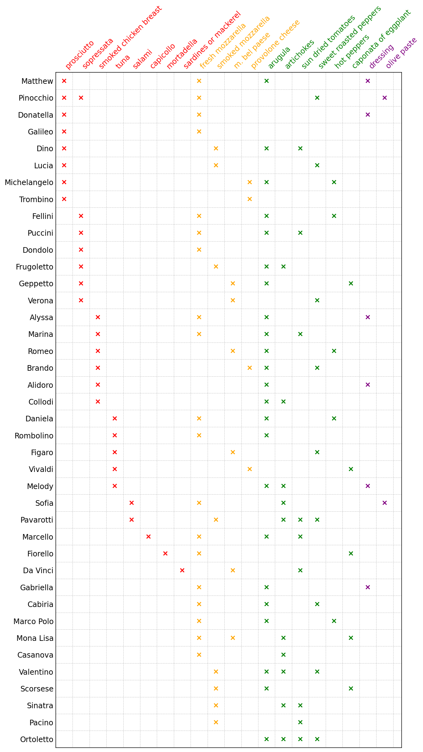
I would like to display the sandwiches in “matrix” form. Each sandwich will be a row, each ingredient will be a column, and the values of the matrix will indicate if a sandwich has a particular ingredient. What’s left is to decide on an order to the sandwich rows and an order to the ingredient columns.
In my initial approach, I coded up a traveling salesman problem in which sandwiches were cities and the overlap in ingredients between any two sandwiches was the “distance” between sandwiches. It would’ve made for the perfect title (“Traveling Sandwich Problem”, obviously), but, contrary to the numerical solution, the result was visually suboptimal.
Thankfully, this is a problem where we can rely on domain expertise. As a sandwich eater myself, I thought about how I typically pick a sandwich. I often look at the meats first, then the cheeses, and then everything else. Ok, let’s sort the ingredient columns by category “rank”: meat, cheese, topping, dressing. Within each category, how about using the recsys go-to of sorting in descending order of popularity? Combining category rank and popularity gives us our full ingredient column order. In SQL, we’d want to do something like
SELECT
  category
  , CASE
    WHEN category = 'meat' THEN 1
    WHEN category = 'cheese' THEN 2
    WHEN cateogry = 'topping' THEN 3
    WHEN category = 'dressing' THEN 4
  END AS category_rank
  , ingredient
  , COUNT(DISTINCT sandwich) as num_sandwiches
FROM sandwich_ingredients
GROUP BY category, category_rank, ingredient
ORDER BY category_rank ASC, num_sandwiches DESC
ranked_categories = sorting.get_ranked_categories(sandwiches)
ordered_ingredients = sorting.get_ordered_ingredients(ranked_categories)
For ordering our sandwich rows, let’s sort them by a special key which is a tuple that contains their most popular ingredient in each category where the tuple is in order of meat, cheese, topping, dressing.
ordered_sandwiches = sorting.get_ordered_sandwiches(sandwiches, ranked_categories)
Visualizing the Matrix
Finally, with our ordered ingredients and sandwiches, we can visualize the Alidoro sandwich menu as a matrix.
sandwich_mat = viz.make_sandwich_matrix(ordered_sandwiches, ordered_ingredients)
fig, ax = viz.plot_sandwiches(sandwich_mat, ordered_sandwiches, ordered_ingredients)
plt.show();
Pricing Analysis
Just for prosciuttos and giggles, I decided to treat my sandwich matrix as a design matrix. I’ll fit a linear regression on the sandwich matrix with the sandwich price as the target variable. The model coefficients will thus be the price of each ingredient, and a bias term will take care of the base price of the sandwich (which includes the bread). As you can see, the model is pretty well-calibrated! I guess Alidoro’s sandwich pricing is pretty consistent.
import statsmodels.api as sm
import numpy as np
y = np.array([sandwich.price for sandwich in ordered_sandwiches])
X = sandwich_mat.copy()

X = sm.add_constant(X, prepend=True)

model = sm.OLS(y, X)
res = model.fit()
res.summary(
    yname="Price ($)", xname=["Base Sandwich Price"] + list(ordered_ingredients)
)
OLS Regression Results

  Dep. Variable:        Price ($)      R-squared:             0.971


  Model:                   OLS         Adj. R-squared:        0.940


  Method:             Least Squares    F-statistic:           31.39


  Date:             Sun, 26 Sep 2021   Prob (F-statistic): 1.48e-10


  Time:                 10:22:02       Log-Likelihood:       9.6979


  No. Observations:          40        AIC:                   22.60


  Df Residuals:              19        BIC:                   58.07


  Df Model:                  20


  Covariance Type:      nonrobust


                           coef     std err      t      P>|t|  [0.025    0.975]


  Base Sandwich Price       8.0451     0.265    30.334  0.000     7.490     8.600


  prosciutto                2.1138     0.166    12.769  0.000     1.767     2.460


  sopressata                1.9554     0.152    12.875  0.000     1.638     2.273


  smoked chicken breast     2.0618     0.182    11.323  0.000     1.681     2.443


  tuna                      1.7025     0.171     9.940  0.000     1.344     2.061


  salami                    2.1288     0.279     7.641  0.000     1.546     2.712


  capicollo                 2.0982     0.327     6.421  0.000     1.414     2.782


  mortadella                3.0738     0.359     8.573  0.000     2.323     3.824


  sardines or mackerel      2.4387     0.375     6.497  0.000     1.653     3.224


  fresh mozzarella          1.3168     0.174     7.581  0.000     0.953     1.680


  smoked mozzarella         1.3141     0.210     6.271  0.000     0.875     1.753


  m. bel paese              1.2748     0.223     5.707  0.000     0.807     1.742


  provolone cheese          1.3559     0.250     5.429  0.000     0.833     1.879


  arugula                   1.2985     0.129    10.076  0.000     1.029     1.568


  artichokes                1.2708     0.140     9.074  0.000     0.978     1.564


  sun dried tomatoes        1.2414     0.147     8.458  0.000     0.934     1.549


  sweet roasted peppers     1.1692     0.135     8.637  0.000     0.886     1.453


  hot peppers               1.0734     0.183     5.850  0.000     0.689     1.458


  caponata of eggplant      1.0643     0.210     5.074  0.000     0.625     1.503


  dressing                  1.0242     0.172     5.963  0.000     0.665     1.384


  olive paste               0.5690     0.285     1.998  0.060    -0.027     1.165


  Omnibus:       14.030   Durbin-Watson:         2.450


  Prob(Omnibus):  0.001   Jarque-Bera (JB):     17.010


  Skew:          -1.089   Prob(JB):           0.000202


  Kurtosis:       5.337   Cond. No.               15.8


Notes:
[1] Standard Errors assume that the covariance matrix of the errors is correctly specified.
We can inspect this model visually by plotting the prices of all of the ingredients. I had no idea mortadella was the most expensive meat.
viz.plot_ingredients(ordered_ingredients, res)
And last but not least, we can compare the sandwich price to the model’s predicted price in order to get an idea if any sandwich’s price is wildly inconsistent. Most sandiwch prices are consistent, although the Gabriella is apparently cheaper than expected at $11.00 for (only!) fresh mozzarella, dressing, and arugula. I don’t know if I’d call that cheap, but, then again, neither is SoHo.
y_pred = model.predict(res.params)
chart = viz.plot_actual_vs_pred(y, y_pred, ordered_sandwiches)
chart.properties(width=400, height=400)